Thursday 4 December 2014

Evaluation of Intentions


In evaluation, the initial motivation for selecting this concept was a strong desire to choose something that was very much different from what I was used to working with. The idea of working with architecture came about from the urban influences module in which I had to take photographs and complete drawings around the city of Manchester. From this, I found a particular passion for working with these structured inanimate objects and enjoyed fusing with human elements. I felt that this offered a unique perspective and brought the coldness of the architecture to life. It was necessary to develop both drawings and paintings from the architecture photographs and I soon realised that the photographs served as the primary tools to create my 
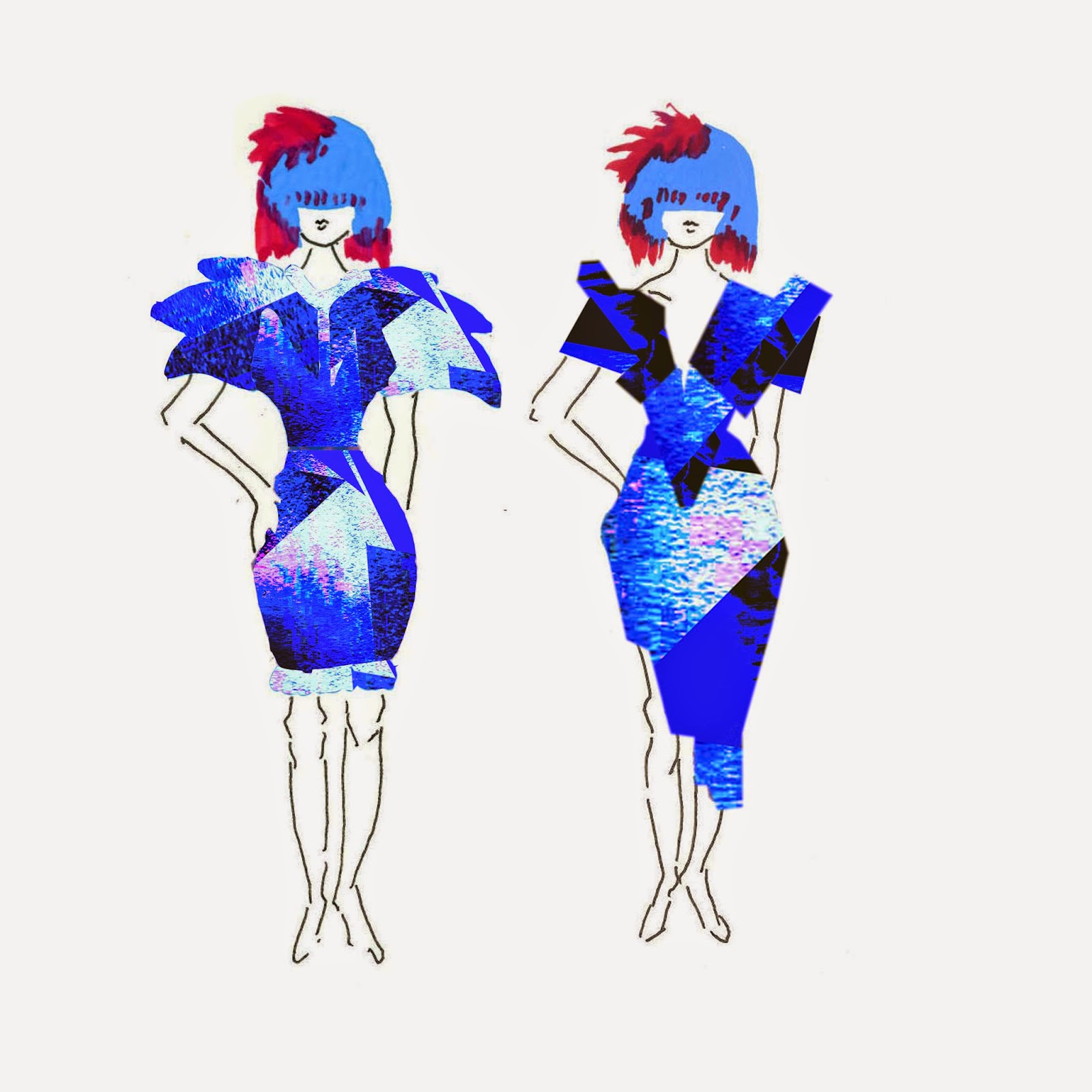
final five print designs. As I wanted to display my paintings through my print designs, I used one painting in Photoshop and modified the colours, cropped shapes to create abstract compositions and also zoomed in on certain elements of the painting where the colours contrasted. By doing this, I felt that I managed to create an abstract unique designs that did not mirror my original painting, but maintained certain elements of it.

I have identified that this concept work would be most suited to a high fashion market as it would not suit a mainstream clientele. This is due to the fact that it contains elements which are very much associated with fine art principles. This tends to incorporate meaning into the work and concepts that are presented. Also, my concepts could be deemed edgy and bold, which are also characteristics associated with the high fashion industry. Fashion, print and film fashion designers such as Alexander McQueen and Nick Knight are two of my main inspirations as they incorporate themes which are visually striking and unique. My main motivation in creating these pieces is to instill a sense of vibrancy and excitement in the observer. This to me is ‘art’ as if these vital components are missing, the artist as failed in emotionally stirring the viewer.

I can envisage that my work will be for an upper market clientele and for individuals who like to make a statement in their clothing. The print designs would be best suited for high fashion catwalk clothing such as elaborate dresses in which a greater surface area allows the patterns to be seen more clearly.

The print designers Hannah Werning and Amy Sia have been most influential in the development of my eight print designs. They both tend to use a high level of contrasting colours and this was an elements that I was particularly drawn to in my work. I liked this as it offered a degree of interest and fantasy to the otherwise dull greyscale architecture images. The combination of these two elements created something that instilled much excitement in me personally as I felt it offered a kind of narrative to the images.
In refining the concept, I decided to complete an art inspired fashion film which consisted of a collaboration of my print designs projected onto a model’s body. This was aimed to mimic and represent what clothes could look like if my images were printed onto them. The model also carried out certain edgy movements which represented the geometric nature of my prints. In this film, I wanted to create an element of movement in the static print designs in order to bring them to life. The choice of music was carefully deliberated upon as I did not want this to be the primary focus. The music was solely meant to accompany and add a sense of drama and atmosphere. As previously mentioned in a blog post, the music used was all royalty free as I felt this reflected a professional image. The inspiration for this film was Showstudio which is a company that advertises fashion and uses a variety of art inspired fashion films.

Thinking about the future, this experience has been useful as it has offered me an insight into how my work could be used within a professional capacity. I always aim to reflect on my learning and evaluate what elements have been useful and also those elements that need improvement. I have found this element exciting and challenging as it has pushed me in a different direction in terms of my creative approach. I envisage that I may continue to use similar colours that would lend themselves to a high fashion designs and films. I will consider continuing using bold patterns in the development of my future work as this offers significant scope for manipulation.


Urban Architecture Film


This last week has been about refining my work so I have edited my final film, and have tried to take on board the feedback from my test film. I have created different angled shots and patterns in my film. I have also tried to show most of the body in some shots in the film. I found it rather difficult to create the film when doing faraway shots of the whole body. I also found that the editing process took a longer time than in the test film as creating the mirrored effect in some my shots. It was quite difficult to get the shots precisely mirrored. I think it was important to spend significant time on my editing for the final film as I wanted to show this film as finished and refined. The process of filming, editing and creative directing is important in my work and I feel it is my specialty and with future ongoing projects. I will consider film to display my creative work.

Final Film


I have created three print designs alongside the five print designs. These three print designs are not shown in my film as they are separate from the five other print designs and they are to show how they would look on a high fashion dress. My illustration designs were inspired by Alexander McQueen’s spring 2010 collection. In this collection. The identity of his work looks quite alien and fantasy and that is what I want to portray in my three print designs. There is a correlation between my three print designs and my five print designs. I originally used an architecture painting from my personal work and developed it into Photoshop altering colours, making shapes and zooming in parts where the colours are quite interesting. All of my eight print designs have a theme of architecture and I have been inspired by Hannah Wering and Amy Sia for all of my print designs as these two designers use colour palettes that I am very much influenced by in my work.


Test Film

During this week, I have developed my final print designs. All of my print designs relate to each other correlating to urban architecture. The inspiration for my work is Alexander McQueen and Nick Knight. They seem to have certain themes in their fashion design and that is the idea I am aiming to replicate in my work. Focusing on Nick Knight’s film work from ShowStudio (ShowStudio 2014), I have created, filmed and edited my own fashion film as an advertisement to present my print and show how it could be constructed into the high fashion industry of film fashion.

It was important to use loyalty free music especially as using legitimate sources is essential when working in a professional industry. I decided to use the Moby website http://www.mobygratis.com/and my request to flying foxes was accepted. I chose this music as it had an eerie and atmospheric element to it. I wanted my film shots to be rhythmical and in time with the music to demonstrate how my prints can be displayed as a motion. After my film was completed I also uploaded it onto the Moby website in order to promote my work and gain some recognition in the public forum.
  
    
I also looked at various music videos for inspiration for the different types of visual work. This included ‘lost in the woods’ directed by film director Ruth Hogben in collaboration with Kanye West and performed by a Kanye West. In this video, I particularly liked the type of movement and mirror work that was utilised, especially with the use of abstract angles and inclusion of architecture.  I felt that this offered a certain emotional substance which was almost full of powerful anguish and passion. I then decided to look at ‘Crazy’ by Robert Hales. This music video interested me again for its mirrored angles and its use of rhythm with composition. There was an obvious use of symmetry in the art work for this video. It used many moving images that depending on how it was viewed, a different object could be visualised.  My main inspiration was from looking at a show studio film called incunabula creative director Joris Debo. This film fascinated me for its use of projection and movement of shapes. I took movement elements from the model in the incunabula film and I directed my model to make similar body gestures against my projected print designs.

Test Film


In my tutorial, it was stated that I should work with different angles and increase the number of body shots in my final film displaying my print designs. My tutor said it was good that the credits do not commence at the beginning as it is much more important that the film content is the priority. However, I also need to consider crediting the model and the music, as this is very important to display in my video. For my final film, it was talked about that the first shot should be faded into the film. For my next film, I need to think about what I want to progress onto and how I can refine my film shots and editing skills. I need to create three more print designs, but I want these to be separate from my film and I want them to be different from my five final print designs. I want to do this to show a variety in my print designs and with my last three print designs I want to show how they would look as illustrations. I still want to maintain the theme of urban architecture, however, I want the process of the three final print designs to be somewhat different.

Print designs & Photoshop


As part of this week’s intention, I have been using a lot of photoshop to develop my skills and play around with different pattern ideas. I have developed my mirrored photographs into print designs by altering the colour cropping and repeating the shapes. My intention for this week, with using my print designs, was to laminate and put them on an overhead projector and displaying them on a model. I then want to paint vibrant colours into the model’s face where my lit up designs hit the surface of the face creating a visual arts fashion video. It was discussed in my tutorial to create a fashion video and this is going to be one of my main intentions in my work. 


I want to display my print designs as a motion picture to advertise how my Prints can be displayed. I have a lot of interest in film as my work for L4 in the last term was using and experimenting with film and the creative arts. I feel like film is the strongest point of my work. Here is a film that I created in L4 Film and drawing. I want to carry on with this idea as I think it is important to identify showing different ways in displaying my print ideas. It was suggested in my tutorial that I look at a website called Show Studio, which was created by Nick Knight who used to be a photographer and now works in filming.

My intention in creating a film was to display that my designs do not have to solely shown on a garment and that they can be shown in different ways as well. I want my model to wear a white dress, so the prints are clearly shown reflecting off the dress. My next stage this week is to create a tester video before I make the final video. It was talked about that I should create two films, one for my final piece such as advertising to them and one to construct a kind of mood and atmosphere. I might just end up with one video showing my print designs. I think it is important this week to identify with my strongest work. My drawings will be put into Photoshop to create more patterns and designs for my video. I think I need to identify who my audiences is designed for and the clear intention of the video.


Wednesday 3 December 2014

Prints on clothes


I have now started to develop the mirroring idea in my photographs. These can potentially be used as my print designs or an ongoing development of using them in Photoshop to create different print designs. Hannah Werning inspired me to construct more mirroring patterns into my work as she utilises a great deal of symmetrical patterning into her designs. By using my mirrored designs, I have developed a new idea. This involves constructing faces into my designs with a mixture of my architectural drawing. This idea became apparent as I wanted to show the quality of fine art within my designs. My intention within these drawings is that the faces represent us as a society and we then create buildings. So, in many ways, we are the buildings as we both live in and create them. My inspiration for this idea was Ricardo flumenl, who is a fine artist who identifies with fashion in his work.

I started to use more colour in my paintings in certain cases and have added a drop of bold colour to give add some sophistication to my work. As I wanted to develop with colour this week, I have created some tie-dye samples using cheesecloth. I do not see a potential in using these tie-dye materials as I am now considering and having my 8 to 10 sample designs on paper. I could potentially use my tie-dye materials for Photoshop by scanning them in. My work is heading towards the fashion side of print design. I really want to develop and identify with more elaborate fashion, such as Alexander McQueen and Vivian Westwood.


I will be using Photoshop for the rest of this unit and it is important that I use and learn how to use different tools. Using Photoshop is not my strongest point, so this will be a good time to develop that skill. In addition, it is important in my career that I learn how to use this package as it is a requirement in the design and fashion print industry. I have started to repeat my drawings and display them in a symmetrical shape. I have done this to try and experiment with ideas on what colours I could have for my 8 to 10 samples and how they can be displayed. These drawings and designs will be taken into consideration, however, I do not envisage a potential for these to be in my final design. I want to play around with the idea of using natural, organic objects for drawings and combining that with people and architecture, creating an almost cultured aspect to my print designs. At one point during the week, when I got stuck, I started to create patterns using a natural objects, such as a leaf. I did this because I was struggling for ideas, and I remembered that recently I had been admiring the leaves in my back garden. I then had the thought that they could be used and to implement them into a repeating pattern but I don’t think I will develop this work as it doesn’t fit with my theme of work.

Wednesday 5 November 2014

Colour Bleeding

The tutorial next week requires that three designers or companies that relate to my fashion research and designs are selected. In addition, this must relate to who I think my work is similar to and who it may be suitable for in terms of future work. It is important at the end of my project that my work is refined and it must be evident how I am going to display that. It was discussed in my tutorial that I should not solely create work using one method such as the mirroring drawings and that I should aim to expand my drawings by having parts mirrored in other areas as well. This will add some variation to my work. It was also posited that I should begin putting my designs on clothing templates to demonstrate what my designs would look like on garments.I need to consider in detail my drawings and where my designs will fit specifically on a garment. Also, how I can construct my designs into the relevant composition as well as a need to consider this scale and how the patterns are laid out.

The inspiration for my work this week came from a print designer called Monica Muñoz who creates talented designs. Working for  MONIQUILLA. I was interested in her work for the use of disperse colour and elements of that which are displayed in my work. I am interested in the use of colour Monica disperses in her work and how she constructs the dispersed patterns into a proportion design. So, in my work I have started to use colour rather than monochrome. I have done this to experiment with what kind of reference palettes can be created. In the tutorial, we also discussed that I should take my drawings into Photoshop and start layering my work using mainline drawings of architecture on the top of my more expressive disperse paintings. This week, I have really experimented with zooming up to the photograph and painting from the detail of the microscopic point, but enlarging them to make them bold paint drawings.

I gained a number of valid points from the tutorial. Namely, was that I need to look at more print designers in the industry. I think the next stage in my work is to create a reference book of all the different types of designers that inspire me with my work that I can relate to.  My tutor also thinks that I need to develop my ideas and construct something that is a little different and something completely unique from what I have created previously. I am now immersed into a routine of using Photoshop with the aim of creating and making different designs and patterns.


Inspirations and Influences


When I started working on my visual research project, I found that my work related to fashion print. I am also very interested in fashion print design and fashion designers such as Hannah Werning, Kristina Collants and Carlene Edwards However, I wanted a change my work by adding fine art designs  and collaborating that with the fashion print to create ideas that are more alternative. I have looked at print designers that utilise fine art into their work such as Auguste Herbin and Anton Barnard. It strikes me that their work is able to take an object and multiply that with the good use of proportion and 3-D like designs.

I see my work going into women’s fashion in liberties perhaps as a printed scarf or flowing dress and that is something I need to identify with in the future. In my tutorial, it was discussed that my designs should look from a perspective of a worm’s eye view and that should be my specific theme. It was also proposed that I should start looking at worm’s eye view points with everything, whether it is a tree or lamppost or whether my work is more about architecture and landscape.  I personally think it could involve both and that I would like to take the idea of observation and play using different objects and scales of places. From my tutorial, I gathered that I need work on more ideas, drawings and concepts with my work so I can develop that into 8-10 sample prints.

I started experimenting with the concept of architecture and making it into a pattern using a pen and bleeding with ink. I did this to experiment with an idea of urban fashion by taking something that is constructive like a building and manipulating it into pattern design. In the tutorial, it was also said that I should push and motivate myself to incorporate a different range of media by using colour and line photographic imagery to create different colour arches in my work. I think I need to develop this use of shape in my work and experiment with not only the visual idea of buildings, but also colour and not stick to a simple range of monochrome. Instead, I should experiment with a vast range of different vibrant colours and if I feel that is not successful, I can go back to the monochrome. It was also suggested by the tutor that I look at some designs from http://www.peoplewillalwaysneedplates.co.uk/two and relate this to my work.


Thursday 16 October 2014

Day exploring Manchester and Bristol

I took a small trip around Manchester before heading to Bristol the following day and decided to take further photos of the perspective view looking out of an attic room in Bristol. I took photos out of the attic room to show the perspective of the different buildings and houses and how they can almost look like patterns fitting into each other like jigsaw puzzles.


My tutorial with Rhianna was very positive. On the Monday, they talked about my work. It was identified that there is a very perspective feel to my work. I was also told that my pattern reflective work of Manchester buildings is my strongest point, and I should go on developing this. In addition, Rhianna told me that my work could identify with a lot of collage work, if I was to mix some of my drawings and paintings together and she said I should experiment with my body of work. We talked about how my view of photographs could be from the perspective of a worm’s eye view which involves looking at something below or from a low or inferred position (the opposite of a bird’s eye view) who looking upwards towards the building which identifies with my research into perspective. It was discussed that there were nice, intricate lines in my work that I should include elements from both the drawing and collage together on a large A3 piece of paper to create something that is quite outlandish. Rhianna said that I should identify with colour in my work and really research into a colour reference that reflects back to some artists I take an interest in. It was talked about in the tutorial group that I should look at an artist and lecturer teacher at MMU called Simone Ridyard and to join her online sketching group on Facebook. It was said that my work mirrors some of the concepts and style that Simone uses, so I will make an effort to research her work more thoroughly.


For the development of my research, I created a pinterest board of urban influences, so that I could get an understanding of how urban influences can be expressed. I looked at different artists and the ones that have inspired me for my development work is Dario Moschette, Wayne Theibaud and Edward Hopper. These artists all exhibit concepts of emotion and mood and that is very important in my work as well. I went to an art exhibition called Return of the Rude Boy over the summer at Somerset House In London and much of the photographers work was very urban inspired and correlates with the urban style in which I am interested in. http://uk.pinterest.com/amb1894/urban-influences/

Urban Influences 15-30 drawings

For my 15 drawings, I really wanted to investigate and explore the idea of urban scenery. So, I took my camera around Manchester taking photographs of the architecture and the cultural streets. I began my investigation by looking at an artist called Wayne Thiebaud (http://www.artnet.com/artists/wayne-thiebaud/). I was really interested in how he is able to change the perspective of a landscape and I am inspired by his use of colour. Colour in my work is usually very bright and bold and he also uses bright colours. I am interested in the way he uses colour and incorporates it into his drawings, making certain parts of his drawings highlighted.

I found that when creating my drawings from my photographs, that when I spent a lot of time on one drawing, it seemed to be neater and more organised. However, the majority of my drawings were constructed over a short amount of time. These drawings also seemed more expressive and conceptual. I like creating drawings under a short amount of time as they tend to exude character and help me to create lines that I usually would not create if I was to spend longer time on the drawing. I feel this is one of my strongest drawings out of the 15 and it is interesting that I did not spend a great deal of time on it, using only a black marker pen. This is a drawing of a street with a fire escape stairway attached to the building. I like the way I have taken a photograph and created something that does not look like the image itself, but has some similarities. This reflects back to Wayne Thiebaud’s work and how he is able to change the landscape and make it into something completely different. I think I need to develop my colour palette in my work as I think I am restricting myself slightly to use colours that I am more used to using.

Some of my strongest work is when I used a black fine liner and added water to the drawing to let it bleed on the page changing the whole concept of the drawing and giving it texture. For the development of my work, I want to create more fine line drawings and adding water to the piece as I liked how the black ink merges into different blues, greys and blacks when adding water. I also want to look at viewpoint in my drawings and create drawings looking from a perspective of someone looking at building or a piece of architecture.


Monday 22 September 2014

Group presentation: summer project feedback


I am considering choosing print for my practice. As the journey I have been through over my summer has helped me conclude to my decision of practice because of my internship with a fashion designer called Derek Rose, who specialises in the pyjamas, I learnt a lot about the print and fashion industry that I am also very interested in and would like to follow this on.
My feedback was constructive and positive. I was in a group of four and we went round on by one presenting our work. In my presentation of my summer project work. I talked about my inspirations in reflections of different artists that have inspired my work and the use of texture and colour that are captured from different places I’ve spent time over my summer.


From my feedback from the rest of the group, Bryony told me to incorporate both film and animation into my practice as they said it’s a strong area of mine. They liked the fact I used a wide range of different artist for each of my drawings. They told me that I should choose print, as a lot of my drawings and patterns in my summer project reflect the practice. Alice said my bird designs reflect print and that I should create more bird patterns as it is one of the strongest parts of my sketch book. They said that my work had been well thought out and everything is considered in my work. 
Charlotte told me I should consider urban influences for my next topic in my work as she said the collar blocks think to it. They said that if I was to improve my work, It would be to have a sort of theme/pathway that goes on developing throughout my sketchbook rather than loads of little topics.

Sunday 21 September 2014

Derek Rose Internship: What Did I Learn

It was interesting to find out how the designers at Derek Rose create their textile collections. I was shown the different stages you need to go through to get fabric printed.  I helped check the strike off sheets to make sure that all of the information is correct. The designers will get small strike offs made of the prints before they get all of the fabric printed so that they can check it looks correct. I then learnt about the different printing techniques used. 

At Derek Rose, they use screen and digital printing. If the design is a geometric for example and has lots of colours, they might use digital printing because it needs to be lined up perfectly.  Also, screens are expensive and you have to have a screen for every colour you use. I learnt that red and navy are hard to print together because the colours mix. Also, silk makes colours and prints look really vibrant and rich.


I am really inspired by the use of colour at Derek Rose and how they consider what will look luxurious and also be commercial.   

A day with Mr Rose: Interview


got the chance to work with Mr Rose himself organising and going through all his archive dating back to the 1950s. He is very inspiring and passionate about textiles and took the time to talk me though the archive. I also got the chance to interview him which helped me learn a bit more about the textile industry and how textile courses compare to 60 years ago. I found it interesting how textile courses in the 1950s were more about the machinery, construction and pattern.  My observation of current textiles courses is that they are less to do with construction and focus more on the artistic side.

Why did you decide to go into the Textiles Industry?

Because my father had been in it. My father had started in the pyjama business in 1926. As you may have seen and I came into the business in 1953, after school I went and studied textiles in Salford and then came into the business from there. I decided I like the textile business and if you don’t like what you’re doing, you shouldn’t be doing it.
What kind of techniques did you learn in your textile degree?
We actually learnt about everything, even the raw cotton. We all had the machinery in Salford, we had the Hopper Bail Breaker carding machine and all the spinning machinery and looms. We had the normal plane loom. We used to weave our own fabrics. We would make our own designs on graph paper and then convert that into a dobby design. Then we knocked the pegs into the things that went round the dobby loom. The way it worked was it would lift the warp threads and that’s why your design was made on graph paper, so that every little square if it was coloured in, it was a peg to lift the warped threads. And so the design was made and don’t forget I’m talking about the 1950s, so I’m talking about 60 years ago, so lots of the machinery you get today didn’t exist back then.

Why did your father decide to go into the textile industry?

In the First World War. He was working in aircraft factory covering airplanes in fabric. It was a sort of cloth and then after the war, he decided to go into a shirt factory. He met a gentleman that became his working partner. They left the shirt factory and started a business of their own. So In 1926, they decided to make pyjamas because there weren’t many people making them.

Were there any difficulties with your father’s business?

To succeed in anything, it’s going to be difficult. Nothing is easy, but my father worked hard at it, and succeeded it and they made a name for themselves. We became the biggest name in pyjamas at the time. My father and his partner carried on the business from 1926 to about 1971 and then he sold the business and I started my own business with my brother-in-law, which is this business, and so all my working life I have been in the nightwear business.

How do you choose the colours for the pyjamas?

What we do is, we take colours that we think are going to be commercial. If you are not commercial. You won’t sell. I mean, you don’t sell the colour brown in pyjamas, right! It’s a no-no. So we don’t do brown in pyjamas that is as an example. Blue is your number one, then all the other colours follow on.

Your quite famous for your blue aren’t you?


Well blue is especially for a man. Men will have any colour you’ll get them as long as it’s blue. We found that women were buying more men’s pyjamas, then men were buying. Women were buying them for their husbands, boyfriends and fathers as gifts for Christmas, birthdays or general presents. So we decided to make the designs to attract the eye of the woman rather than the man, because the man, buying clothes is very boring for them and very conservative. Men would buy blue and blue and blue and blue. Boring! So we made a lot of multi coloured designs and nice designs that would attract the woman buying them and is still does. So we have both sets of pyjamas. We have the basic blues and white etc, but then we also have the multicoloured fancy and print designs. These are the things that have developed over the past 40 years. 


Derek Rose Internship

I recently spent two weeks in central London interning at Derek Rose. I learnt a huge amount about the textiles and fashion industry and it has also inspired my personal work. Working with the designers gave me a good look into how the design process works from inspiration to design.  It was very fun and interesting and I was constantly busy with different tasks, which I had to perform to the highest standard. This included organising fabrics, making mood boards, research and participating in design meetings.

All fabrics used at Derek Rose have to feel luxurious, as they need to be comfortable to wear in bed and around the house. The colour palette of the classic sleepwear collection uses a lot of blue and also colours inspired by the regimental colours from the war.  The seasonal sleepwear collection uses modern and bright colour palettes. 


Thursday 11 September 2014

Patchwork Painting

N4t4 has been a graffiti artist that I have always been inspired by for as long as I can remember. N4t4 based his work around illustration. N4t4 enjoys working with different media and the concept of aboriginal markings and graffiti art.  I am influenced by N4t4’s use of layering and vibrant colour. So in my own painting modelled by my father, I wanted to add a modern twist by change the concept of traditional portraits and add my own modern twist upon the both of these paintings. I tried to express the use of mood and visual language by using my own technique of vibrant colours and patchwork pattern. I could go on to develop this further by creating texture and using vibrant threads to creating an embroidery piece.


This piece is called Jubilee skate park face1, Out of all off his pieces I’ve looked at I am drawn to this one the most. What really captures me about this piece is how the position of the head is angled and the set of the head is faded away. The colours are striking an enigmatic and complex facial expression dominates the piece. The figures plump lips and the play of light which deifnse the facial surfaces give the piece a sensual, even erotic air.  

Tuesday 9 September 2014

Dad & Me

I am interested in using the human element of relationship with family and friends in a way that draws out its complex nature. This embroidery piece is a machine sewed drawing showing the birth of myself and my father holding me for the first time. I made this embroidery piece as a birthday present over his August birthday.  These relationships shape our character and are completely fundamental to the kinds of people we turn in to, to our understanding of ourselves and to our understanding of our place in the world. I find Laura McCafferty work particularly interesting; because her compositions are so unusual and unique that they really subvert the meaning of traditional family scenes  I am interested in the fact that family relationships are in one sense private and self contained, but at the same time they take place within the context of the society and they are shaped by its judgements and values.  So I’m interested in exploring the fine line between what is private and what is public in relationships with family and friends.
  
Laura McCafferty uses textiles, sewing and screen printing to create textured scenes of everyday life.  Her work has a slightly absurd or surreal feeling.  She uses colourful construction with lots of floral prints.  Her work is figurative and she often depicts people engaged in everyday activities.  It is, perhaps, the contrast between her offbeat composition, floral-textured backgrounds, and the mundane nature of the tasks in which her characters are engaged, that lends her work its peculiar atmosphere.  She is particularly interested in the nature of human existence, as understood through the everyday experiences that we can all relate to.

The Old Card Players shows a group of old men playing poker.  She connects to this group because it is her grandfather and his friends but more generally she is making a point here about the importance of friends across the life span.  The image could represent old people – or indeed any people – around the world because their physical attitudes reflect the subtle and complex nature of human social interaction.  The image also has her typical use of mixed techniques, appliqué of floral prints and a slightly off-kilter composition that lends the piece a quirky and homespun air, creating a warm atmosphere with perhaps undercurrents of something more sinister, even perhaps absurd.

Thursday 4 September 2014

Life Drawing


I spend an hour down by the docks, in my hometown Bristol, doing live drawings. I drew things around me that interested me and caught my eye. I potentially like to use the concept of life drawing for developmental work to create alternative and unique designs.


Wednesday 3 September 2014

Hyde Park Bird Designs

I went to Hyde Park and discovered the amount of geese, swans and ducks there were. It interested me how different types of birds creating different patterns and compositions with their bodies working in unison. These photos that I have taken describe the visual elegance of movement of these birds.


These photos helped me with my first-hand research by going on and developing them into bird patterns. I was influenced by a print-based designer Amy Sia I discovered on pinterest. Sia is well known for her cushion cover and scarf print designs. She uses exciting colour and modern patterns that have really encouraged me in my work.
http://www.amy-sia.com/collections/cushions


Tuesday 2 September 2014

Saatch Gallery: Antonio Malta

I went to the Saatchi Gallery in London and one painting stood out from me. A Painting created by Antonio Malta. His use of composition, shape and bold colour has really inspired my work. This piece of artwork itself is untitled but standing as a large scale of 230x360cm. This painting was so unique I was later to find out that Malta creates YouTube videos of the stages of his work.


This has really interested me and I wanted to create a self-portraits using only an ink pen and the use of line pattern drawing, as influenced by the shapes of Antonio Malta. The effect of the video almost displays that the drawing is being created by itself.


Facial Fetchers


Ricardo Fumanal is interested in the fine art of photography for fashion and advertising. He specialises in illustration drawing using a broad array of techniques and languages. The media he mainly uses is mainly drawing with marker, pencil and ink on paper and constructing compositions his work that show two meanings.
His work looks as if action of speed and stillness exist working side by side creating a gaze effect upon his work. His images flow and it provides a representation as a collage of human activity. His compositing experiments with confrontation between figures and background; he is inspired by icons and spontaneously topical items that influence his work and make it unique and interesting.


The detailed representation of how he makes materials even shine in his work to make the clothing upon the person look life like. He likes to layer his work, and experiment with different blocks of colour; he shows beauty in its finest with his delicate use of shape and tone. The subject matter is important to my work as I like to construct composition and delicate line through my drawings. My drawings are often personal. This is a drawing of a very good friend of mine and I wanted to show the intricacy and the sculptor like form of the facial features. Using the elements of Fumanal’s composition tone of sketch and use of blocked colour I have created my own response to his work and as an artist he inspires me to draw people showing their true personality and figment of beauty.