Thursday 20 February 2014

PE Task 2

The first piece of inspiration I have chosen to discuss is taken from the London based surface designer and illustrator Leah Nelson. Mirroring my own influences she is particularly influenced by the Art Deco style as well as its forerunner Art Nouveau. I am especially passionate about these art movements as they encompass an eclectic colour style and draw on inspiration from a number of artistic sources. A common element of Nelson’s work and my own is the association with certain elements of cubism which was also a precursor to the Art Deco. One aspect that I really appreciate and has influenced my work significantly is the puzzle like composition of the geometric shapes I incorporate. In contrast to the often retro bright colour style used by Nelson I prefer to utilise more soothing colours and softer hues that may elicit a sense of calm.


The image on the left is taken from Leah Nelson’s patterns collection and the image on the right is from my collection. From observing the two, it is clear that I have taken some inspiration from her work in terms of the geometric shapes used as well as apparent white space around the shapes. In contrast to Nelson’s work, I find my work to be less about the rigidity and perfection of straight lines, proportion of shapes and consistent shading. I like the fact that my work appears more personable and involves some jagged imperfect lines as well as varieties in shading.


My second inspiration for some of my work is Italian born artist Francesco Lo Castro. Much of her work utilizes a variety of geometric shapes but in contrast to Nelson the shapes always appear almost three dimensional in nature and almost like they are moving. The colours are also indicative of a dreamy psychedelic theme with soft blurry edges. I also like the fact that her work has many layers and uses a variety of colours overlapping and flooding into each other. Many of her pieces are reminiscent of an explosion of shapes and detail. I wanted to create something that used these concepts but put my own individual stamp on it.


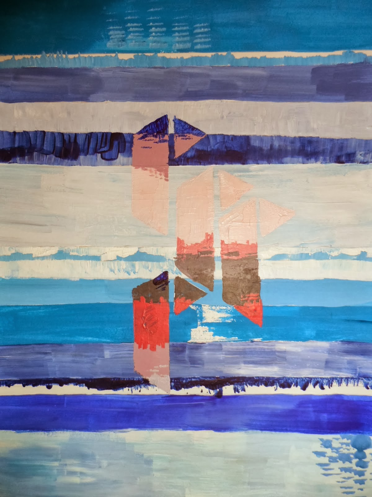
Another vibrant artist that has inspired me greatly is John Lowrie Morrison who is one of Scotland’s leading landscape painters. Like my own work, he is passionate about the emotions that colours can convey. In many of his paintings, blue is the key ingredient as it is in mine and he acknowledges that this is often used to stimulate calmness and has certain healing properties. His image on the left uses many of the same principles as I like to adopt such as textured brushstrokes, colour and the general mood that may be elicited from the onlooker. Even though his work is landscape and I do not create this type of art, I do identify with his work. I feel my image on the right does represent a sea and sky theme and although does not use any objects such a house etc., the geometric shapes used act as a replacement. 

Tuesday 18 February 2014

Hand Painting


Leah Nelson, a textile print designer, inspired me for my hand designs.  I wanted my hand designs to have a flow to them by using my colour reference I chose colours that contrasted with each other. Leah Nelson is a surface designer and illustrator who is inspiring with her use of bold tribal motifs and art deco designs. Her work has inspired me to create patterns that were exciting and impelling.  I like the composition in Leah Nelsons work and how she is able to enlarge her shapes and create a pattern that fits together like a puzzle. I am influenced by Leah Nelson’s motifs that reflect a rigid and blocked form to them. I have tried to take on board her skills in her work and reflect them in my own work. I wanted my hand designs to look exciting and vibrant.

This is one of my favourite print designs that I have created. I have tried to enforce as much of my colour reference into this design. I like using lots of colour in my work. I want people to enjoy the tones of my work and the kind of mood it exudes. Although the colours in this piece contrasts with each other they also complement each other.


3-D Triangle


In this drawing workshop our task was to create a 3-D design that replicates what we are doing in our textile worlds. I decided to make a 3-D triangle. My initial inspiration was Richard Sweeney, a product designer who explores structure and pattern. His inspiration is complex geometries and patterns of growth in nature. He uses simple materials both handmade and machine manufactured and he tries to use everyday materials such as paper to create unique structural forms. His work interests me because the sculptures that he creates have a very natural, organic feel to them. In my own work I want to respond to Richard Sweeney’s complex designs by creating my own.  On each side of my triangle I wanted to enforce my print designs, by doing this I used a scalpel during the process of making my 3-D triangle, I noticed it had a sort of cultural replication to the design. I think it could almost link to Egyptian shapes and patterns.


Mechanical Drawing

Friday drawing lesson was about mechanical drawing. This lesson really interested me. It helped us to think in different ways by using moving objects to create marks and thus creating drawings. Mechanical drawing was about using a surface and exploring using different movement objects to create patterns. For example, the types of movement media that were used were windup toys, elastic bands, cogs, kebab skewers, cocktail sticks and rods of wire. My favourite process was just using one peg but I also used a motor and attached it to my pen and it created a sort of rough pen line that created a jagged line on the surface of my page. What I wanted to do was a collection of successful repeated pattern drawings that resembled my print work. Zimoun, an artist that was suggested in the power point, interested me. I liked how his drawings were repetitive and showed a rhythmical motion to the process of his work. I was inspired by his 144 prepared dc-motors, wires isolated, cardboard boxes 27x13x13cm Zimoun 2013. I think this drawing shows a lot of repetitive pattern which I like and it was these aspects of his art that I tried to produce in my own way using gouache paints and an end of clothes peg.


Train Tickets

Through my project my inspiration of data was to do with ticket collection. As I have a lot of train tickets, I thought of used tickets as a process of drawing. I thought the tickets in themselves could create good patterns and mark making. As I am going to create motifs from my screen print, I decided to cut my tickets up and rearrange them, forming them into different shapes and patterns to help me think of different designs for my motifs. What is important this part of the process of my project is shape and pattern. I wanted my shapes to conform to quite bold patterns. I played around with my tickets, cutting them up and forming them into different patterns and shapes. The outcomes of my drawings helped me develop my designs to create potential motifs. I never thought that using different processes of drawing such as train tickets could be so useful for pattern design


Dip Dye


The processes we used in this session was dip dye. I have used this technique of dyeing before, and have always really enjoyed it. This lesson was about the process of dying and also to teach ourselves how to mix the dyes and work independently to create our own artwork.
I really enjoyed this lesson, I was able to experiment using different colours and different techniques to create different imprints with the dip dye.


I found that wrapping up the cotton and dipping it in different dyes created a good effect for pattern. I would like to use dip dye again experimenting with my own reference of colours and preferably to screen print my own designs on top of them. What I found challenging in this lesson was getting the right consistency of colour through my fabric. It takes concentration and measurement to get a good balance between each colours when dip dyeing.