Showing posts with label Summer Project. Show all posts

Monday, 21 September 2015

Film of churchs

 
 Primary Research
church Pattern


 I wanted to capture the shapes and patterns of the church through a motion of film. I have layered different clips of the shoots I took at the Bristol cathedral to create a moving repetitive pattern. I did this to create my own inspiration of how I can create different designs within my collection. I also want to develop this film into a projection and film a model with a white garment as the projection of the different shapes and patterns project and move across her body. I will be doing this so I can get a better understanding how the prints can be displayed across the body form and onto a garment.  I have used free royalty music for this film from Moby’s website as for my more developed and important films I will be collaborating with Oisin who writes his own music but this process of film I have worked on now is just for my own research and concept

Churches


Primary Reasearch

Through my second year project I have based my print designs and drawing on modern or historical architecture. I will be carrying on this concept but through historical architecture of church vaults. I have chosen this concept as I have always been inspired by church vaults and have felt that I could create dynamic and rhythmical designs with this type of concept. I have been to the Bristol cathedral and I was able to take some photographs of the ceiling. I wanted the capture the different shapes, lines and patterns the vault demonstrates, this will be applicable for when I start drawing or designing from these photographs as the shapes demonstrate complex structures.

Mirjam Rouden Interning


Mirjam Rouden
Interning


This week I focused on pen drawing different types of flowers. I spent all week on these two drawings. I wanted to make these designs as detailed and life-like as possible. I looked into science books and books of flowers from the book shelf at Mirjam Rouden for inspiration of designing flowers. As this week they were getting ready so sell their collection to somewhere abroad groups of interns including myself were told to cut fabric digital samples ready for their sale. From looking at the new collections it has inspired me to create designs that are complex and dynamic.

Mijam Rouden Interning


 Mijam Rouden 
Interning

In the second week of my internship I was told to do more maintenance work. That involved cleaning screens with a water jet. This was quite long and tiring work but through this process it has helped me to understand how to clean a screen properly when taking off the old print design and the chemicals that are used to clean the screen until completely see through. I was then told by Cindy to focus on more intricate flower drawings with colour and tones. The drawings that I do will then be scanned into the computer and the team of designers will mock up print designs with my and other intern’s drawings. I feel like this process of drawing has helped me to create more intricate and refined work that I want to create in the process of my degree work.


Mijam Rouden Interning


Mijam Rouden
Interning


 Over this summer I interned at Mirjam Rouden Textile design studio. Located in East London, Bethnall Green. Mirjam Rouden is a textile designer specialising in Print design and she is well known for her digital and colour discharge prints. Mirjam Rouden’s prints have been known to sell at Inigo which is partnered with Premiere vision. Mirjam Rouden’s prints are internationally sold to countries such as Italy, Paris and the US which gives Mirjam and her team the privilege to travel around the world. Her print designs have been known to feature in companies such as Diane Von Furstenberg, Banana Republic & Maladrino. 


In my first week of interning I was expected to provide my portfolio so Cindy one of Mirjam’s head designers could identify my strengths in designing, drawing and digital skills.  So this week I was directed to focus on drawing florals with black ink and black pencil and go on errands on the tube to get designs printed onto tracing paper made for screen printing. I enjoyed this process of work as I was able to work on my drawing skill and take time on drawings to create perfect floral shapes. I was also told by Cindy to work on small drawings of flowers onto tracing paper, she wanted me to work on tracing paper so it is easier for the team to make printing screens with the tracing paper. I found the work enjoyable as I feel I my strengths lie within drawings and designing.

V&A Exhibtion


Alexander McQueen savage beauty.


I had the privilege of seeing the Alexander McQueen Savage Beauty Collection at the V&A in London. The collections were overwhelmingly beautiful and striking. There was limited involvement in the exhibition as no photographs were to be taken and no sketching either. The exhibition was also very crowded and you were only allowed to view his work for a limited amount of time. Besides that his themes within his collection were breathtaking and there was an almost magical atmospheric look to his clothes. His earliest work demonstrated a raw and edgy culture to his work.
What I found most striking was his Romantic Nationalism and his Platos Atlantic collection.


His Romantic Nationalism concept came from his Scottish ancestry. The room looked regal and majestic and the classical music in the background complemented his work. I discovered he first used tartan in his Highland Rape collection but soon came back to it 11 years later in his beautiful collection called ‘The Widows Of Culloden’. This collection was a much softer and less aggressive rendering than his Highland Rape collection. 


Platos Atlantic collection was to the end of his exhibition.  I find this work inspiring and creative. The narrative behind this collection was his most fantastical concept. The collection is about if the ice caps melt in the future and the seas have risen.  The dress collection represents what we as a society would look like if man had evolved under water. The dresses are presented as an army of fishlike creatures, a sort of hybrid animal alien form. Within this collection in my opinion he has been able to master the quality of digital printing and there all derived from natural organisms.  From seeing this incredible collection I have been inspired to create narratives in my designs and prints. I think with a narrative to my work it will provide a better understanding and thoughtful process within my collection. I also inforce film within my project so I can identify the narrative with my work though fashion film making.

Fashion film for Rianna Phillips


Fall 15\16
 http://www.riannaphillips.com/

 Fashion film for Rianna Phillips 

I found it most exciting working on the fashion film for Rianna as I was able to have complete direction to how  the model should move and perform with the pages, I also had the freedom to use dynamic editing shots with creating the film. Making this film for Rianna has helped me develop my editing skills with rewinding clips and mirroring shots. It has also given me the opportunity to make fashion films on a professional level. The Music is by Oisin Baber and this music was specifically designed for this film.


WORKING FOR RIANNA


Behind the scenes:
Fall 15\16
http://www.riannaphillips.com/

Interning 

Working for Rianna Phillips was exciting and I felt like I was able to claim my own independence interning for her. She directed me to create two films for her new collection. This was a big achievement for me as I specialize my work with fashion film making. The first film to be created is a behind the scenes film that me and my friend Sion (a film student) both worked on this part and filmed the process of the photography shoot throughout the day. I wanted to capture as much as I could from the hair and makeup to the direction of photography. I set both cameras to high brightness setting and a high resolution as from looking at Rianna’s work she has a very clean, crisp look to her collections. I edited the film to show shadows between each clip I did this to show how time of the day goes quickly whist filming. Below is the behind the scenes film I have filmed and edited. The music is by Oisin Baber a student in Bristol that I was able to collaborate with through a connection of my sister. He wrote this music to fit perfectly to the different shots.
  

Sunday, 21 September 2014

Derek Rose Internship: What Did I Learn

It was interesting to find out how the designers at Derek Rose create their textile collections. I was shown the different stages you need to go through to get fabric printed.  I helped check the strike off sheets to make sure that all of the information is correct. The designers will get small strike offs made of the prints before they get all of the fabric printed so that they can check it looks correct. I then learnt about the different printing techniques used. 

At Derek Rose, they use screen and digital printing. If the design is a geometric for example and has lots of colours, they might use digital printing because it needs to be lined up perfectly.  Also, screens are expensive and you have to have a screen for every colour you use. I learnt that red and navy are hard to print together because the colours mix. Also, silk makes colours and prints look really vibrant and rich.


I am really inspired by the use of colour at Derek Rose and how they consider what will look luxurious and also be commercial.   

A day with Mr Rose: Interview


I got the chance to work with Mr Rose himself organising and going through all his archive dating back to the 1950s. He is very inspiring and passionate about textiles and took the time to talk me though the archive. I also got the chance to interview him which helped me learn a bit more about the textile industry and how textile courses compare to 60 years ago. I found it interesting how textile courses in the 1950s were more about the machinery, construction and pattern.  My observation of current textiles courses is that they are less to do with construction and focus more on the artistic side.

Why did you decide to go into the Textiles Industry?

Because my father had been in it. My father had started in the pyjama business in 1926. As you may have seen and I came into the business in 1953, after school I went and studied textiles in Salford and then came into the business from there. I decided I like the textile business and if you don’t like what you’re doing, you shouldn’t be doing it.
What kind of techniques did you learn in your textile degree?
We actually learnt about everything, even the raw cotton. We all had the machinery in Salford, we had the Hopper Bail Breaker carding machine and all the spinning machinery and looms. We had the normal plane loom. We used to weave our own fabrics. We would make our own designs on graph paper and then convert that into a dobby design. Then we knocked the pegs into the things that went round the dobby loom. The way it worked was it would lift the warp threads and that’s why your design was made on graph paper, so that every little square if it was coloured in, it was a peg to lift the warped threads. And so the design was made and don’t forget I’m talking about the 1950s, so I’m talking about 60 years ago, so lots of the machinery you get today didn’t exist back then.

Why did your father decide to go into the textile industry?

In the First World War. He was working in aircraft factory covering airplanes in fabric. It was a sort of cloth and then after the war, he decided to go into a shirt factory. He met a gentleman that became his working partner. They left the shirt factory and started a business of their own. So In 1926, they decided to make pyjamas because there weren’t many people making them.

Were there any difficulties with your father’s business?

To succeed in anything, it’s going to be difficult. Nothing is easy, but my father worked hard at it, and succeeded it and they made a name for themselves. We became the biggest name in pyjamas at the time. My father and his partner carried on the business from 1926 to about 1971 and then he sold the business and I started my own business with my brother-in-law, which is this business, and so all my working life I have been in the nightwear business.

How do you choose the colours for the pyjamas?

What we do is, we take colours that we think are going to be commercial. If you are not commercial. You won’t sell. I mean, you don’t sell the colour brown in pyjamas, right! It’s a no-no. So we don’t do brown in pyjamas that is as an example. Blue is your number one, then all the other colours follow on.

Your quite famous for your blue aren’t you?


Well blue is especially for a man. Men will have any colour you’ll get them as long as it’s blue. We found that women were buying more men’s pyjamas, then men were buying. Women were buying them for their husbands, boyfriends and fathers as gifts for Christmas, birthdays or general presents. So we decided to make the designs to attract the eye of the woman rather than the man, because the man, buying clothes is very boring for them and very conservative. Men would buy blue and blue and blue and blue. Boring! So we made a lot of multi coloured designs and nice designs that would attract the woman buying them and is still does. So we have both sets of pyjamas. We have the basic blues and white etc, but then we also have the multicoloured fancy and print designs. These are the things that have developed over the past 40 years. 


Derek Rose Internship

I recently spent two weeks in central London interning at Derek Rose. I learnt a huge amount about the textiles and fashion industry and it has also inspired my personal work. Working with the designers gave me a good look into how the design process works from inspiration to design.  It was very fun and interesting and I was constantly busy with different tasks, which I had to perform to the highest standard. This included organising fabrics, making mood boards, research and participating in design meetings.

All fabrics used at Derek Rose have to feel luxurious, as they need to be comfortable to wear in bed and around the house. The colour palette of the classic sleepwear collection uses a lot of blue and also colours inspired by the regimental colours from the war.  The seasonal sleepwear collection uses modern and bright colour palettes. 


Thursday, 11 September 2014

Patchwork Painting

N4t4 has been a graffiti artist that I have always been inspired by for as long as I can remember. N4t4 based his work around illustration. N4t4 enjoys working with different media and the concept of aboriginal markings and graffiti art.  I am influenced by N4t4’s use of layering and vibrant colour. So in my own painting modelled by my father, I wanted to add a modern twist by change the concept of traditional portraits and add my own modern twist upon the both of these paintings. I tried to express the use of mood and visual language by using my own technique of vibrant colours and patchwork pattern. I could go on to develop this further by creating texture and using vibrant threads to creating an embroidery piece.


This piece is called Jubilee skate park face1, Out of all off his pieces I’ve looked at I am drawn to this one the most. What really captures me about this piece is how the position of the head is angled and the set of the head is faded away. The colours are striking an enigmatic and complex facial expression dominates the piece. The figures plump lips and the play of light which deifnse the facial surfaces give the piece a sensual, even erotic air.  

Tuesday, 9 September 2014

Dad & Me

I am interested in using the human element of relationship with family and friends in a way that draws out its complex nature. This embroidery piece is a machine sewed drawing showing the birth of myself and my father holding me for the first time. I made this embroidery piece as a birthday present over his August birthday.  These relationships shape our character and are completely fundamental to the kinds of people we turn in to, to our understanding of ourselves and to our understanding of our place in the world. I find Laura McCafferty work particularly interesting; because her compositions are so unusual and unique that they really subvert the meaning of traditional family scenes  I am interested in the fact that family relationships are in one sense private and self contained, but at the same time they take place within the context of the society and they are shaped by its judgements and values.  So I’m interested in exploring the fine line between what is private and what is public in relationships with family and friends.
  
Laura McCafferty uses textiles, sewing and screen printing to create textured scenes of everyday life.  Her work has a slightly absurd or surreal feeling.  She uses colourful construction with lots of floral prints.  Her work is figurative and she often depicts people engaged in everyday activities.  It is, perhaps, the contrast between her offbeat composition, floral-textured backgrounds, and the mundane nature of the tasks in which her characters are engaged, that lends her work its peculiar atmosphere.  She is particularly interested in the nature of human existence, as understood through the everyday experiences that we can all relate to.

The Old Card Players shows a group of old men playing poker.  She connects to this group because it is her grandfather and his friends but more generally she is making a point here about the importance of friends across the life span.  The image could represent old people – or indeed any people – around the world because their physical attitudes reflect the subtle and complex nature of human social interaction.  The image also has her typical use of mixed techniques, appliqué of floral prints and a slightly off-kilter composition that lends the piece a quirky and homespun air, creating a warm atmosphere with perhaps undercurrents of something more sinister, even perhaps absurd.

Thursday, 4 September 2014

Life Drawing


I spend an hour down by the docks, in my hometown Bristol, doing live drawings. I drew things around me that interested me and caught my eye. I potentially like to use the concept of life drawing for developmental work to create alternative and unique designs.


Wednesday, 3 September 2014

Hyde Park Bird Designs

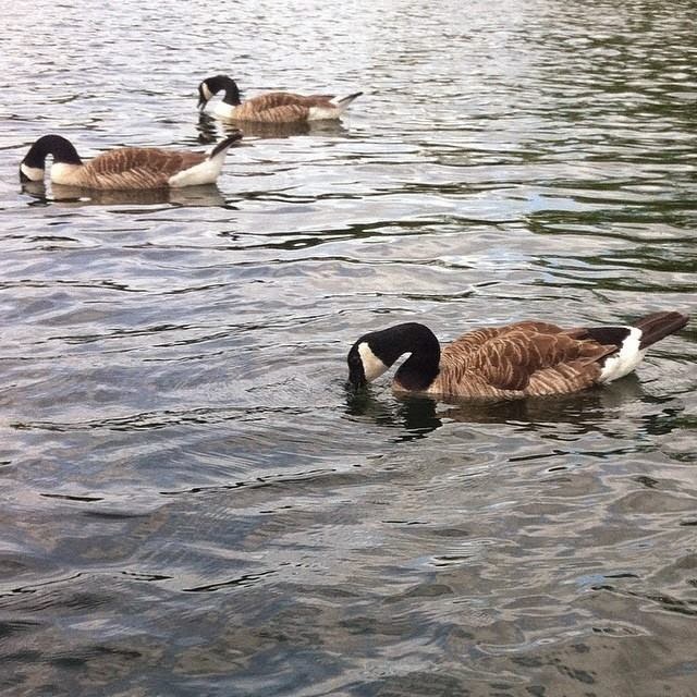
I went to Hyde Park and discovered the amount of geese, swans and ducks there were. It interested me how different types of birds creating different patterns and compositions with their bodies working in unison. These photos that I have taken describe the visual elegance of movement of these birds.


These photos helped me with my first-hand research by going on and developing them into bird patterns. I was influenced by a print-based designer Amy Sia I discovered on pinterest. Sia is well known for her cushion cover and scarf print designs. She uses exciting colour and modern patterns that have really encouraged me in my work.
http://www.amy-sia.com/collections/cushions


Tuesday, 2 September 2014

Saatch Gallery: Antonio Malta

I went to the Saatchi Gallery in London and one painting stood out from me. A Painting created by Antonio Malta. His use of composition, shape and bold colour has really inspired my work. This piece of artwork itself is untitled but standing as a large scale of 230x360cm. This painting was so unique I was later to find out that Malta creates YouTube videos of the stages of his work.


This has really interested me and I wanted to create a self-portraits using only an ink pen and the use of line pattern drawing, as influenced by the shapes of Antonio Malta. The effect of the video almost displays that the drawing is being created by itself.


Facial Fetchers


Ricardo Fumanal is interested in the fine art of photography for fashion and advertising. He specialises in illustration drawing using a broad array of techniques and languages. The media he mainly uses is mainly drawing with marker, pencil and ink on paper and constructing compositions his work that show two meanings.
His work looks as if action of speed and stillness exist working side by side creating a gaze effect upon his work. His images flow and it provides a representation as a collage of human activity. His compositing experiments with confrontation between figures and background; he is inspired by icons and spontaneously topical items that influence his work and make it unique and interesting.


The detailed representation of how he makes materials even shine in his work to make the clothing upon the person look life like. He likes to layer his work, and experiment with different blocks of colour; he shows beauty in its finest with his delicate use of shape and tone. The subject matter is important to my work as I like to construct composition and delicate line through my drawings. My drawings are often personal. This is a drawing of a very good friend of mine and I wanted to show the intricacy and the sculptor like form of the facial features. Using the elements of Fumanal’s composition tone of sketch and use of blocked colour I have created my own response to his work and as an artist he inspires me to draw people showing their true personality and figment of beauty.