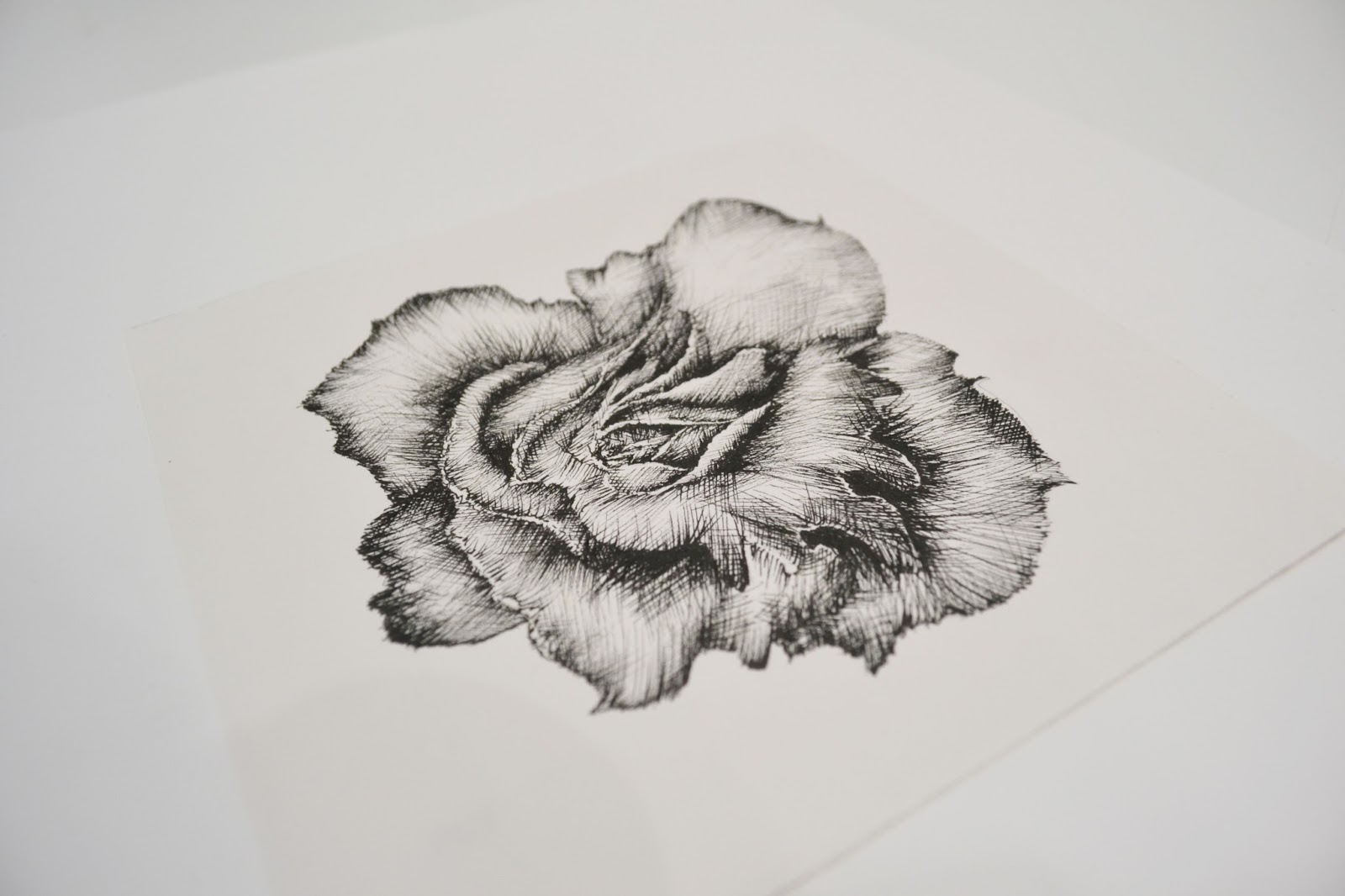
Over the Christmas break I have created more flower
drawings for the development of my final print designs. I have spent a
considerable time on these drawings to make them as perfect as possible for
screen printing.
Thermochromic ink in water
investigation
The idea of
these two films was to show my interpretation of showing heat change in water.
The part of my self-initiated project was to display a way of showing a basic
movement without a garment or a model to show the concept of colour changing
through heat that is linked to my sportswear that changes colour with heat.
The processes
of both these films were challenging to show the colour changing within the
water, but creating these two videos help me to think differently about
displaying a concept in an alternative way. Film can be seen on memory stick
Over the Christmas break I have
planned to enter the Berlin fashion film festival competition. Over this time I
have directed my efforts towards filming, editing and creating a pitch to the
BFFF competition.
During the making of this film I
wanted to relate to my self-initiated project ideas with the film itself. As my
project is aiming to show heat changing through colour in my print designs
forsportswear I came up with the
concept of using a moving projection of different coloured prints that changed
colour across a dancer’s body as she was moving. With the construction of this
film, I decided that I did not want to make it look projection. I want to make
it look like the prints are actually changing colour across the white garment.
When editing this fashion film I
made two final copies; one that had a lot of editing mirroring of the body and
lots of different editing techniques and another which involved a film that had
a more natural approach and less editing.
When working with Orson, he led the
cinema photography and Ina the dancer was very easy to work with; they both
understood my vision in what I wanted to create. It is very important when
working with a film crew and your model or performer to have a good business
relationship to create a film that has a strong concept. I chose to film the
dancer on the floor with the projection on top of her so giving the illusion
that there was not a projection at all but that the prints were ingrained into
her clothes and her skin, which gave a good advertising print for me as a
designer. When shooting the project, Orson was able to get close up shots of
the body and different abstract movements that the model was creating. I feel
that this gave a good effect when I was editing as you are able to see the
print on the body from a close perspective across the skin and the clothing.
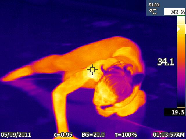
This week I made an
investigation film that looked into thermal imagery and movement. I found a
dancer called Ina Colizze to work with in my film. Orson also helped me with
the cinematography. As this was a film to display a test, I wanted the film
setting to be simple and plain. I got Ina to improvise a dance, as Orson and I
were filming from a normal Nikon camera and also taking snaps from the thermal
camera. At the end of the shoot I realised the photographs were not saving on
the thermal camera memory card. To overcome this difficulty, I had to film Ina
again. So, I arranged with her to film one of her dance classes in a studio.
With the resolution of this problem, it turned out for the best as I had the
ability to take photographs of other female dances with the thermal camera
picking up their heat. This was good for my research as I had a significant
amount more photo footage to work with and it allowed me to have a better
understanding on where on the body heat is most produced.
Once I had all of my
footage and imagery to work with I generated everything into a short
investigation film. I have not displayed this on YouTube as I have used music
that has rights against sharing it in a media promotion. As a consequence, I
have stored this film on a memory stick.
Within
my presentation I was able to show my test Thermochromic prints and successfully showed them changing colour with a hand print of heat.
I was also able to say that I have sourced a Thermochromiccamera
from the environmental team on the University campus. With this film, I will
create an investigation film that will show a dancer moving in a space that
will have stills in the editing process of the thermo images. It was said in my
feedback if I am using a Thermochromic camera, I should use the still images to feed into my print designs, whether it
is the shape of the thermos stills or putting the colours into my colour
reference.
It
was commented that it would be experimenting with the scale of my geometric and
floral print designs. From this feedback, it has made me think about practising
the scale of my prints within the Berlin Fashion Film competition.
One idea with my film work was
to show a woman dancing using a temperature sensitive camera but as these are
quite expensive to hire out it was not an option to use one. As a result, it
was suggested in my tutorial that I film
someone using a normal camera and then edit it in Final Cut Pro to give an idea
that the body is giving off heat and that it is getting hotter and hotter the more
body with will react to my thermochromic ink with in my prints.
Alternatively, I could try and hire out a heat sensitive camera from the
science department in Geoffrey Manton on the MMU campus. I need to start
focusing on how I can start making visual processes, showing the ideas of new
technology rather than solely researching into them.
I have bought some thermochromic ink pigment
paint sourced from the internet. With this paint I have created test screen
prints from my geometric and floral drawings. This test was to find out how
well the colours change through heat. I found that the black ink worked well
displaying the change of colour from black to grey to white with a warm palm touch. The
blue and red ink did not work as well changing colour with heat. In the future
of my final print designs I will use more black ink than blue or red.
Within my colour reference I
have taken colours from my Salford Keys architecture photographs and
experimented using these colours through paintings using hints of bright yellow
and orange.I have completely left
church architecture and focused my drawing on modern geometric and structured
shapes. I have chosen to do my drawing structure in a different way; by
creating a geometric structure from my photograph and then developing them into
a painting. It has helped me to create complex shapes and forms.