Wednesday, 30 April 2014

Stop Motion animation


Stop Motion animation:

I want to start showing in my work how I can represent fairgrounds through drawings. I have created a stop motion animation and my inspiration was one of the headdresses at the pleasure Beach in Blackpool. I wanted to create stop motion animation to represent a development of the drawing that is suggestive of a show girl costume by using vibrant tones of colour, glitter and stars.

This is my first creation of the stop motion animation. I wanted to experiment with vibrant colour and almost create a still life performance by using just paint and glittery stars. 


Drawing to Music

Drawing to Music

In the past, I never thought that sound and music could be a large part of drawing and art. Through this lesson I found that there is a way of documenting music and sound through the expression of lines and drawing.
I wanted the lines of my drawing to express the rhythm of the music and if the music was fast and up tempo the lines in the drawing would be increasingly jagged and less orderly. If the music was slow and soft my lines would be straight and neat.  I chose to use different colours to show the difference of each music track.

My drawings were presented in a large scale as I wanted to express my whole body moving with the sound of the music and transferring that onto each piece I completed.


Sunday, 30 March 2014

Belle Vue

Belle Vue :


Belle Vue was a fairground based in Manchester in the 1920’s where people from the city would come and see the exotic animals.  At that time, it was a luxury and people would revel in its activities and sites. It was well known that it sold the most beer  in the UK than anywhere else around that time. The type of people that visited Bella Vue were often upper class that dressed formally for their visit. Although Belle Vue had a range of exotic animals, it was renowned for keeping them under poor conditions and animals were documented to not survive for long which may have decreased its popularity. I found this information hard to listen to in the lecture as it sounded like the animals were almost treated as disposable toys and solely an object for entertainment. I find the leaflets for Belle Vue very creative and it appeared that they advertised the fairground like it was an exotic rainforest.


Blackpool Pleasure Beach

I enjoyed the trip to Blackpool, however, I found that seeing the amusement park when it is not open to the public was a somewhat eerie experience.

Costume room for ice-skating performances:


I found the costume room particularly inspiring. The room exploded with colour and creative fantasy-like costumes and I feel that this aspect will significantly inspire my creative process. The feathered headdresses that dangled from the sealing were visually pleasing as they were incredibly free-flowing and vibrant. It was almost as if the costumes had a life of their own with dominant outline structured designs to the clothing. I would like to demonstrate in my work how I can create vibrancy and originality from the costume room and develop it in a simplistic way of using colour, movement and shape.


Costume workshop:

When looking at the costume workshop it made me think of how much hard work and dedication is involved in making such beautiful and elegant headdresses. I would like to adopt some of the same techniques that I witnessed in the costume workshop area. Pantomime costume, in general, does not interest me greatly however,  there are a number of areas I could utilize and develop in my own work such as the expressive use of colour and perhaps using colour as a type of performance.


Rollercoaster’s :

The different shapes and forms of the rollercoaster’s at Blackpool was of fascination to me. I like the fact that it looks like the construction is built upon layers. I have tried to develop this through my drawing of the different lines that the rollercoaster’s create. I wanted my drawings to appear as if they had motion integrated within them so when drawing I made the lines very vigorous.


At the end of the trip we were given an opportunity to go ice skating and it made me think of the  lines in the ice that are carved by the ice skates and how ice skating has a flying like quality, almost similar to riding on a rollercoaster. Ice skating could be another form of drawing as the ice represents a blank canvas and the blades almost mirror a drawing tool. The different curves and swirls that are indented into the ice are formed with the tool. I think that the ice skating rink and the rollercoaster park share similar features as both ice skating and rollercoaster’s  share an element of danger, excitement and adrenaline release.


Thursday, 20 February 2014

PE Task 2

The first piece of inspiration I have chosen to discuss is taken from the London based surface designer and illustrator Leah Nelson. Mirroring my own influences she is particularly influenced by the Art Deco style as well as its forerunner Art Nouveau. I am especially passionate about these art movements as they encompass an eclectic colour style and draw on inspiration from a number of artistic sources. A common element of Nelson’s work and my own is the association with certain elements of cubism which was also a precursor to the Art Deco. One aspect that I really appreciate and has influenced my work significantly is the puzzle like composition of the geometric shapes I incorporate. In contrast to the often retro bright colour style used by Nelson I prefer to utilise more soothing colours and softer hues that may elicit a sense of calm.


The image on the left is taken from Leah Nelson’s patterns collection and the image on the right is from my collection. From observing the two, it is clear that I have taken some inspiration from her work in terms of the geometric shapes used as well as apparent white space around the shapes. In contrast to Nelson’s work, I find my work to be less about the rigidity and perfection of straight lines, proportion of shapes and consistent shading. I like the fact that my work appears more personable and involves some jagged imperfect lines as well as varieties in shading.


My second inspiration for some of my work is Italian born artist Francesco Lo Castro. Much of her work utilizes a variety of geometric shapes but in contrast to Nelson the shapes always appear almost three dimensional in nature and almost like they are moving. The colours are also indicative of a dreamy psychedelic theme with soft blurry edges. I also like the fact that her work has many layers and uses a variety of colours overlapping and flooding into each other. Many of her pieces are reminiscent of an explosion of shapes and detail. I wanted to create something that used these concepts but put my own individual stamp on it.


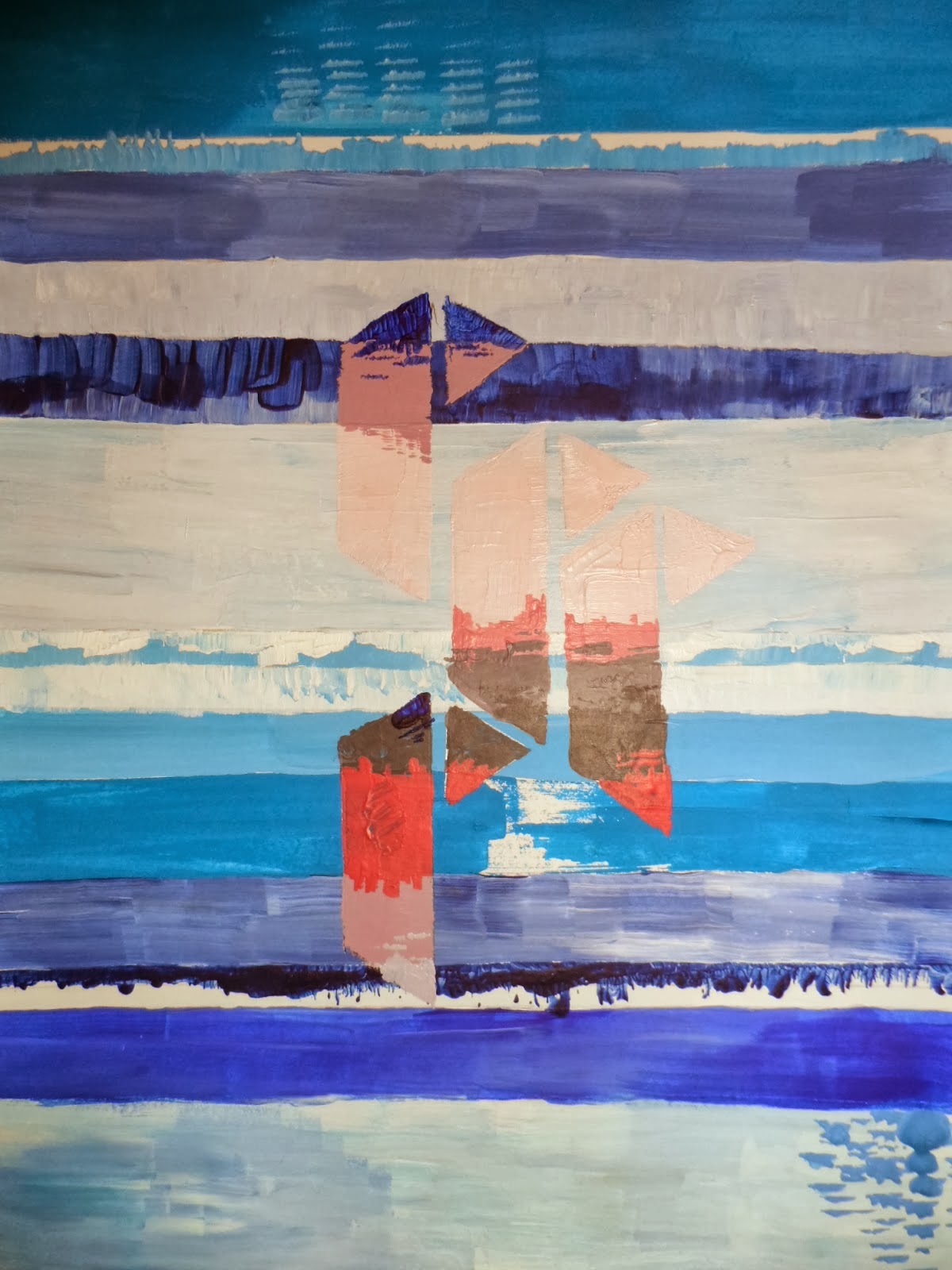
Another vibrant artist that has inspired me greatly is John Lowrie Morrison who is one of Scotland’s leading landscape painters. Like my own work, he is passionate about the emotions that colours can convey. In many of his paintings, blue is the key ingredient as it is in mine and he acknowledges that this is often used to stimulate calmness and has certain healing properties. His image on the left uses many of the same principles as I like to adopt such as textured brushstrokes, colour and the general mood that may be elicited from the onlooker. Even though his work is landscape and I do not create this type of art, I do identify with his work. I feel my image on the right does represent a sea and sky theme and although does not use any objects such a house etc., the geometric shapes used act as a replacement. 

Tuesday, 18 February 2014

Hand Painting


Leah Nelson, a textile print designer, inspired me for my hand designs.  I wanted my hand designs to have a flow to them by using my colour reference I chose colours that contrasted with each other. Leah Nelson is a surface designer and illustrator who is inspiring with her use of bold tribal motifs and art deco designs. Her work has inspired me to create patterns that were exciting and impelling.  I like the composition in Leah Nelsons work and how she is able to enlarge her shapes and create a pattern that fits together like a puzzle. I am influenced by Leah Nelson’s motifs that reflect a rigid and blocked form to them. I have tried to take on board her skills in her work and reflect them in my own work. I wanted my hand designs to look exciting and vibrant.

This is one of my favourite print designs that I have created. I have tried to enforce as much of my colour reference into this design. I like using lots of colour in my work. I want people to enjoy the tones of my work and the kind of mood it exudes. Although the colours in this piece contrasts with each other they also complement each other.


3-D Triangle


In this drawing workshop our task was to create a 3-D design that replicates what we are doing in our textile worlds. I decided to make a 3-D triangle. My initial inspiration was Richard Sweeney, a product designer who explores structure and pattern. His inspiration is complex geometries and patterns of growth in nature. He uses simple materials both handmade and machine manufactured and he tries to use everyday materials such as paper to create unique structural forms. His work interests me because the sculptures that he creates have a very natural, organic feel to them. In my own work I want to respond to Richard Sweeney’s complex designs by creating my own.  On each side of my triangle I wanted to enforce my print designs, by doing this I used a scalpel during the process of making my 3-D triangle, I noticed it had a sort of cultural replication to the design. I think it could almost link to Egyptian shapes and patterns.